Monday 30 April 2012

Wallpaper draft design

After discovering Deborah Bowness' lovely wallpaper, I thought about taking my own photos and collaging these with some of my geometric patterns.

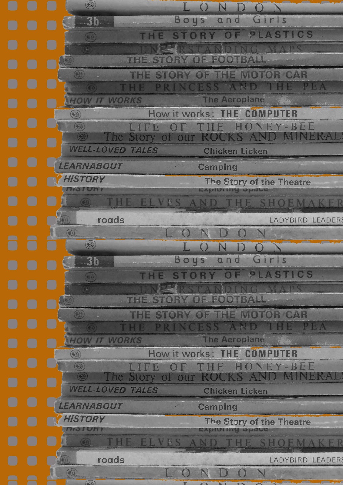
Here is one result of this initial experimentation using Photoshop to layer my own photo onto existing patterns.

This design uses my own photo (made black and white) of my favourite Ladybird books (all time favourite " The Elves and The Shoemaker" ). I had to use photoshop to repeat the stack of books height wise. I need to "cut out" the Ladybird stack better using Photoshop so that the background design does not bleed into the books - it needs to have a professional look, so I will be honing my Photoshop skills yet again!

I am thinking about this potential design for wallpaper and need to consider how large a design to do and what drop I want for the design. I will potentially be adding stitch, hand collage and a wee bit more colour to it.


More to follow soon ( I hope..)


Sunday 29 April 2012

More Wallpaper of a photographic nature

Deborah Bowness designs ultra trendy wallpaper from photographs with a tinted quality and a trompe l'oeil effect. The colours are aged almost creating a really interesting effect. I would like to explore using my photography in this current project but have not reached a point where I have the design material to take the photos.


Wallpaper -a look at innovative designs

www.lindaflorence.me.uk
Although I am pleased with my draft final designs, I feel they lack that certain ommph that comes with a well thought out design and some innovation, so I have gone back to the research desk to try and discover what I can add to my designs to make them that little bit special. These designers provided me with a few ideas..

Some time ago I came across the designer Linda Florence and her wonderful scratch card wallpaper. Parts of her wallpaper designs are covered in silver which can be scratched off to reveal a different pattern underneath. I like the idea of connecting with the wallpaper and being able to change the design whenever or however you desire.


I have also discovered the wallpaper of Sian Zeng a graduate from Central St Martins and an awarding winning designer. Her wallpaper is amazing as she uses a magnetic liner behind her wallpapers so that her own illustrative magnets can be added to her beautifully drawn wallpaper. She also has some fun printed giant stuffed scissors, really cool. These designs, whilst nothing like my own style inspire me to create designs that the user can interact with in some way. Although, I have no idea as to how I can do this at present and so its perhaps something to quietly contemplate...

www.sianzeng.com
www.sianzeng.com
www.sianzeng.com

Friday 27 April 2012

Paper Collage experiment

Part of my original brief was to do paper collage for my final outcome using some of my geometric designs.

So I have set about to create a contemporary paper collage design using my own designs. The result is below.


I think that although some of the individual pieces of this design look nice, frustratingly it is not great for two reasons:-

  1. Too many rounded rectangles
  2. The spray mount shows through the tracing paper


The next time I do paper collage I will use double sided tape and PVA glue not spray mount. 

This little glimpse into paper collage has made me think that perhaps my designs are not too suited to collage and I will be exploring more photography mixed in with my geometric designs for a more successful outcome - I hope.

Wednesday 25 April 2012

Draft designs for Final Major so far....

I have been experimenting via Photoshop with various designs for my final and here are a few for you to critique, if you feel inclined.

My inspiration for all of these has been 1970s colour palettes, Scandinavian designs and  my camera obsession.


 The imagery behind of the camera repeats can not really be seen above and this design was the least popular in my crit, so I will not be taking this forward.


This is a very simple Scandi style print although it is perhaps too bright for a living room wall in its current form. I need to look into a more muted orange for this design and perhaps a different background shade.


Inspired by abstract illustrative art from the 1970s I feel this is successful in drawing the eye in different ways. It took a long time to create in Photoshop but I got there in the end. Again, the brightest orange needs muting in my opinion.


Friday 20 April 2012

Siggi Eggertsson

Siggi Eggertsson is a really interesting Icelandic graphic designer/ illustrator. I have been exploring Scandinavian design with it's distinct graphicness, boldness and use of colour (IKEA here we come!) and it occurred to me that it has parallels with 1970s design in many ways. It is interesting the way most Scandi design has over the decades, never lost this strong sense of craft, colour and shape. This factor has made me explore the world of graphic design to a greater extent and I came across Siggi's fab work.

Siggi's work is playful and sometimes comments on world issues; such as his beautiful christmas baubles which feature an atomic bomb explosion (somewhat unexpected). He is equally at home though with designing geometrically pleasing patterns commercially for the likes of Mulberry for example. I was really happy to see the diversity of his work as it's very inspiring for my Final major project. His use of colour exploration is similar to mine and I when I look at his designs I visualize paper collage, a technique that I am keen to use in my FMP (Final Major Project).


Source:  www.siggieggertson.com

Thursday 5 April 2012

Spring colours in NY

Spring colours in NY by chippyjackson
Spring colours in NY, a photo by chippyjackson on Flickr.

The contrast of spring pink blossom against bright blue sky with a very small empire state building peeking out.. Really like the mix of colours in this shot

The Highline

The Highline by chippyjackson
The Highline, a photo by chippyjackson on Flickr.
Via Flickr:
The Highline is a disused above ground railway track that has been converted into a modern walkway with amazing views of the city below. Great views of the cityscape from here.

The Red Studio

The Red Studio by chippyjackson
The Red Studio, a photo by chippyjackson on Flickr.

MOMA, the Museum of Modern Art has a fantastic and wide range of some famous modern paintings by Picasso, Warhol, Matisse, Monet ,Dali, Rothko and many many more.
I enjoyed viewing this stunning painting, Matisse cleverly emphasises the paintings and sculpture in his studio whereas functional objects are barely there. Apparently he painted this many times with different backgrounds and even though his studio was white he finally settled on the vibrant Red background.. completely awe inspiring and makes me want to paint!

Monday 2 April 2012

Impossible Project NYC

Impossible Project NYC by chippyjackson
Impossible Project NYC, a photo by chippyjackson on Flickr.
Via Flickr:
Today I made a long awaited trip to Impossible Project NYC. You have to press a buzzer and enter one of those old fashioned lifts (where you see the floors pass you by) to get to the 5th floor. It was completely worth the detour to visit this amazing place full of old Polaroid cameras, some rather rare and prohibitively expensive. I decided on a couple of sets of PX colour film to suit my newly acquired 600 camera and two old camera bags. I thought to myself how restrained I had been and left this lovely place with a happy feeling.
www.the-impossible-project.com/ if you want to know more..

NY Subway - Colour love

NY Subway by chippyjackson
NY Subway, a photo by chippyjackson on Flickr.
Via Flickr:
Whilst travelling on the line towards Staten Island Ferry, I noticed this very retro colour palette of tangerine oranges and beige. It's perfect for my colour palette and so I took a speedy snap as people left the train. The colours evoke memories for me, our camper van from childhood was painted tangerine and cream ( to cover the rust and wire holding it together!) and at one stage in the 70s we even had an orange front door. I can't decide if that made us a fashion forward family or ... not.

18 minutes

18 minutes is how long it takes before you can use your Subway card again, if you got it horribly wrong at the barrier. ho hum!

New York New York

so good they named it twice ;). NYC is jam packed with phenomenal architecture when you look skywards but is also buzzing at ground level with maniac drivers, trembling pavements from subway trains and lots of indignant honking. I really want to take some closer pics of the Chrysler Building with its beautiful patterned facade, although it still looks pretty good in the snap I took from the Empire State Building.

View from Empire State

View from Empire State by chippyjackson
View from Empire State, a photo by chippyjackson on Flickr.

Empire State Silhouette

Empire State Silhouette by chippyjackson
Empire State Silhouette, a photo by chippyjackson on Flickr.

Times Square

Times Square by chippyjackson
Times Square, a photo by chippyjackson on Flickr.