Showing posts with label geometric designs. Show all posts

Tuesday, 2 July 2013

Unravelled at Alnmouth

Snip 2013
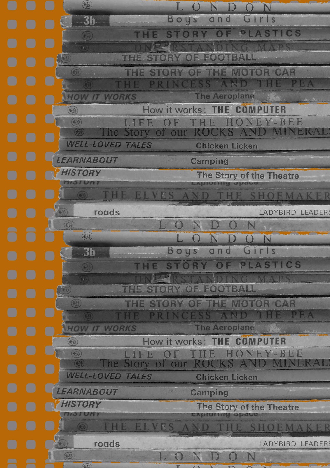
My paper collage featuring my own pattern designs and childhood book references displayed at Alnmouth Arts Festival

Unravelled was part of a joint collaboration with Sara Walton exploring vintage domestic textiles and the unknown men, women and children who made them.


Friday, 1 February 2013

Pattern drawing by revolving stencils


This wonderful set of spirograph came to me from a relative who was having a clear out of games. I love the packaging colours and the way it is listed as being "A new invention for everyone"! The typography is simple and cool, I think.
This boxed game started me thinking how different children's games are today, there is something relaxing and meditative about creating spirographs. Inside the box the biros had long gone but there were delicate spirograph designs on papers- I have passed this on to my clever friend who makes recycled book kits www.homewardboundbooks.me.uk


Sunday, 20 May 2012

Lampshade final design decision

I really wanted to create another motif for my final collection and managed to do this last week using a cut out sunburst I hand cut within my sketchbook. I echoed this design in Photoshop with a transparent background. The inspiration for the motif was sunny simple motifs from Clothkits and I think it echoes their vibe quite closely.


From this motif I am deciding whether to choose a coloured/monochrome lampshade. I have deliberately chosen a strongly shaped shade to suit the rounded design and make it look more contemporary.


The designs will incorporate lasercut or hand cut paper stuck onto a base lampshade. If I was to consider target market amongst retailers I think this is fairly mainstream but I envisage it being high qualityand so would aim for John Lewis. 


Saturday, 19 May 2012

Final designs for wallpaper


This design was creating using my new fish scale motif and repeat filling the design in Photoshop I added colourways and also paint bucketted in my ladybird stack motif with the new faded colours and tidily cutout design.

The 1970s fish scale pattern is brought up to date by using a more contemporary colour palette but still has a retro feel to it.

I think this design is successful and when it was printed on wallpaper it too on a certain faded quality which is great as long as the orange does not turn into peach. For some reason I have an aversion to peach!

Target market wise I would not consider this for John Lewis as it is not mainstream enough and perhaps even a bit too bold and quirky for their market. I would like to think that a high end homeware retailer such as Habitat would consider this print. Even independent home decor retailers might consider this if their product ranges were fairly quirky.


This is the same design only without the ladybird background dropped in. Again, the colours are much more subtle in the printed wallpaper.


I scaled the design smaller for this wallpaper and created a layered imagery using my photo of my Brownie camera. 

The Brownie image was my own photo with a pencil filter added in Photoshop I then added a little bit of acid green to the image before repeating it into the design. 

Although the Brownie camera is not from the 1970s its still vintage and works well my obsession relating to the rounded rectangle shape. I like the way that although the whole camera can not be seen it still is a familar shape and really a rather cute image (well to me anyway).

If I could develop the above designs it would be to add in tonal gradients or stripes in tones of orange to the fish scale motif and then repeat. I would be interested to see how this would change the design.


Tuesday, 15 May 2012

Wallpaper and fabric printing... done!

After a difficult week ( yes, it's only Tuesday ) of stress and working on my final outcome I have eventually been able to print my wallpaper and fabric design.

I am really pleased with the results although the wallpaper printed out a lot lighter tonally than I had anticipated. I will have to realise this for future wallpaper designs as the print room technician told me this was one of the drawbacks of using a digital fabric machine to print wallpaper.

My fabric design for my stool pad is graphic and bold with a quirky edge to it. I now need to wash the fabric to get rid of all the soda ash within it and hope that it does not distort.

Friday, 11 May 2012

Final shape for Wallpaper design


Who would have thought it could take so long to design this shape in Photoshop..

I knew that I wanted to use this shape within my patterns the moment I saw it in my photocopies of a Habitat catalogue from 1971. I discovered loads of backdated, vintage copies of Habitat and Clothkits catalogues from the 70s at the Research library within the National Museum of Scotland in Edinburgh. I had originally gone to take some photos of 70s memorabilia but ended up with lots of photocopies from this library. Here's the link and details of a fantastic library ..  National Museum of Scotland Research Library

It has not been easy creating this shape and I eventually discovered how to make it by playing with the shape tool options within Photoshop. It is basically 3 circle shapes in Photoshop but overlapped with a cutout on either side of the main circle. Looking good I think!

It is a great shape and so versatile, so I will be experimenting over the next few days to see what I can create with it. Really excited about the possibilities.

Monday, 7 May 2012

Anthropologie Wallpaper with Chip It!


Wow, I absolutely love this app.

This app allows you to add colour chips to images of your choice online. It's really easy to use and I have started to use it on a few more images.

A really useful feature for choosing colour palette options for my Final Major. Big thank you to Dyane Brown for pointing this superb app out to me.

I had a thought whilst using this app that it would be a good idea to produce a design using my ever growing collection of vintage Ladybird Books. The colours of the spines and the front makes for a lovely retro colour palette that I could explore, although it may not be quite the colours I am looking for when marrying this up with my other geometric designs. It is possible that I could go monochrome or mute the colours of the books somewhat.

Monday, 30 April 2012

Wallpaper draft design

After discovering Deborah Bowness' lovely wallpaper, I thought about taking my own photos and collaging these with some of my geometric patterns.

Here is one result of this initial experimentation using Photoshop to layer my own photo onto existing patterns.

This design uses my own photo (made black and white) of my favourite Ladybird books (all time favourite " The Elves and The Shoemaker" ). I had to use photoshop to repeat the stack of books height wise. I need to "cut out" the Ladybird stack better using Photoshop so that the background design does not bleed into the books - it needs to have a professional look, so I will be honing my Photoshop skills yet again!

I am thinking about this potential design for wallpaper and need to consider how large a design to do and what drop I want for the design. I will potentially be adding stitch, hand collage and a wee bit more colour to it.


More to follow soon ( I hope..)


Friday, 27 April 2012

Paper Collage experiment

Part of my original brief was to do paper collage for my final outcome using some of my geometric designs.

So I have set about to create a contemporary paper collage design using my own designs. The result is below.


I think that although some of the individual pieces of this design look nice, frustratingly it is not great for two reasons:-

  1. Too many rounded rectangles
  2. The spray mount shows through the tracing paper


The next time I do paper collage I will use double sided tape and PVA glue not spray mount. 

This little glimpse into paper collage has made me think that perhaps my designs are not too suited to collage and I will be exploring more photography mixed in with my geometric designs for a more successful outcome - I hope.

Wednesday, 25 April 2012

Draft designs for Final Major so far....

I have been experimenting via Photoshop with various designs for my final and here are a few for you to critique, if you feel inclined.

My inspiration for all of these has been 1970s colour palettes, Scandinavian designs and  my camera obsession.


 The imagery behind of the camera repeats can not really be seen above and this design was the least popular in my crit, so I will not be taking this forward.


This is a very simple Scandi style print although it is perhaps too bright for a living room wall in its current form. I need to look into a more muted orange for this design and perhaps a different background shade.


Inspired by abstract illustrative art from the 1970s I feel this is successful in drawing the eye in different ways. It took a long time to create in Photoshop but I got there in the end. Again, the brightest orange needs muting in my opinion.