Showing posts with label Cheryl Jackson designs. Show all posts

Sunday, 20 May 2012

Lampshade final design decision

I really wanted to create another motif for my final collection and managed to do this last week using a cut out sunburst I hand cut within my sketchbook. I echoed this design in Photoshop with a transparent background. The inspiration for the motif was sunny simple motifs from Clothkits and I think it echoes their vibe quite closely.


From this motif I am deciding whether to choose a coloured/monochrome lampshade. I have deliberately chosen a strongly shaped shade to suit the rounded design and make it look more contemporary.


The designs will incorporate lasercut or hand cut paper stuck onto a base lampshade. If I was to consider target market amongst retailers I think this is fairly mainstream but I envisage it being high qualityand so would aim for John Lewis. 


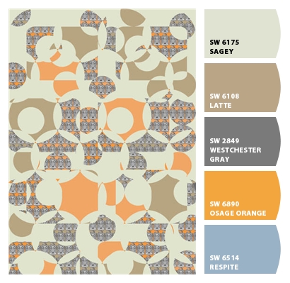
Final design - Chipped


I could not resist using "Chip It" with my final design and it's interesting to see a respite blue in there not sure where that came from!

Saturday, 19 May 2012

Final fabric design for upholstery

Here's my final fabric design slightly familiar but complete with little cameras in it. The colour palette has taken some work with these motifs and I eventually used more faded colours than I had previously used with a background cream inspired by old aged book pages.


Here is the design mocked up onto a stool (not the stool I will be using) just to give an idea of what it might look like ultimately. I have recently learnt to use the lasso tool properly in Photoshop and used it to create this image. This image is definitely one of the more successful ones for my Moodboard.


I would aspire to produce fabric that is good enough and sits well with Ercol's range of furniture. I like the idea of translating a series of prints into upholstery designs for furniture ranges. 

Final designs for wallpaper


This design was creating using my new fish scale motif and repeat filling the design in Photoshop I added colourways and also paint bucketted in my ladybird stack motif with the new faded colours and tidily cutout design.

The 1970s fish scale pattern is brought up to date by using a more contemporary colour palette but still has a retro feel to it.

I think this design is successful and when it was printed on wallpaper it too on a certain faded quality which is great as long as the orange does not turn into peach. For some reason I have an aversion to peach!

Target market wise I would not consider this for John Lewis as it is not mainstream enough and perhaps even a bit too bold and quirky for their market. I would like to think that a high end homeware retailer such as Habitat would consider this print. Even independent home decor retailers might consider this if their product ranges were fairly quirky.


This is the same design only without the ladybird background dropped in. Again, the colours are much more subtle in the printed wallpaper.


I scaled the design smaller for this wallpaper and created a layered imagery using my photo of my Brownie camera. 

The Brownie image was my own photo with a pencil filter added in Photoshop I then added a little bit of acid green to the image before repeating it into the design. 

Although the Brownie camera is not from the 1970s its still vintage and works well my obsession relating to the rounded rectangle shape. I like the way that although the whole camera can not be seen it still is a familar shape and really a rather cute image (well to me anyway).

If I could develop the above designs it would be to add in tonal gradients or stripes in tones of orange to the fish scale motif and then repeat. I would be interested to see how this would change the design.



Friday, 18 May 2012

Quilting my final design

I have been discussing whether or not to quilt my final design with my mentor and also some of my peers and I have to admit that initially I was keen to bite the bullet for my first quilting project!

The design with cut out shapes of circles and rounded rectangles would lend itself to quilting possibly but I have decided not to quilt on this occasion due to the fabric I have chosen to print on ( a heavyweight upholstery cotton drill) and also due to the fact that it is not really a technique that I find suits my style. With limited time to hand in I have now focussed my attention on other areas.


Tuesday, 15 May 2012

Wallpaper and fabric printing... done!

After a difficult week ( yes, it's only Tuesday ) of stress and working on my final outcome I have eventually been able to print my wallpaper and fabric design.

I am really pleased with the results although the wallpaper printed out a lot lighter tonally than I had anticipated. I will have to realise this for future wallpaper designs as the print room technician told me this was one of the drawbacks of using a digital fabric machine to print wallpaper.

My fabric design for my stool pad is graphic and bold with a quirky edge to it. I now need to wash the fabric to get rid of all the soda ash within it and hope that it does not distort.

Tuesday, 8 May 2012

Final (well nearly but not quite) designs

Pencil filter in Photoshop using Brownie
 camera photo in repeat
I like this Browniefest due to its simplicity. I could use a number of colourways with this imagery and I think this design lends itself well to stationery as it's quite a small print.
Pencil filter using ladybird stack
There is something so nice about a black and white image. I enjoyed creating this image and can not believe it was derived using just one easy filter. This design would look really good with lasercut incorporated into the text of the design. I have started to think about lasercutting text on a larger scale than this and I could perhaps use some of the text from within the ladybird books. I envisage using tracing paper lasercut so one of my geometric designs will stand behind the text.
partially coloured ladybird book
stacks with a plain background

I think I might prefer the back and white ladybird books with a geometric background but I am not sure.. I will see what some of my peers think about the variation in designs.


Laser cut text for possible lampshade or paper design

I have considered adding a further dimension to my designs by laser cutting text into them. The text has to be stencil text for it to cut out and I copied and pasted a free font from the internet to use in Illustrator to achieve this.


I cut into white card and also into tracing paper. The result on card is great but I would want it to be bigger than it is. The tracing paper burnt slightly but  a decent effect was gleaned.

If I enlarge the text it will need tidying up as the edges are a bit wobbly, I need to perfect using the pen tool within Illustrator to finish this task.


Friday, 27 April 2012

Paper Collage experiment

Part of my original brief was to do paper collage for my final outcome using some of my geometric designs.

So I have set about to create a contemporary paper collage design using my own designs. The result is below.


I think that although some of the individual pieces of this design look nice, frustratingly it is not great for two reasons:-

  1. Too many rounded rectangles
  2. The spray mount shows through the tracing paper


The next time I do paper collage I will use double sided tape and PVA glue not spray mount. 

This little glimpse into paper collage has made me think that perhaps my designs are not too suited to collage and I will be exploring more photography mixed in with my geometric designs for a more successful outcome - I hope.