Tuesday 2 July 2013

Unravelled at Alnmouth

Snip 2013
My paper collage featuring my own pattern designs and childhood book references displayed at Alnmouth Arts Festival

Unravelled was part of a joint collaboration with Sara Walton exploring vintage domestic textiles and the unknown men, women and children who made them.


Friday 1 February 2013

Pattern drawing by revolving stencils


This wonderful set of spirograph came to me from a relative who was having a clear out of games. I love the packaging colours and the way it is listed as being "A new invention for everyone"! The typography is simple and cool, I think.
This boxed game started me thinking how different children's games are today, there is something relaxing and meditative about creating spirographs. Inside the box the biros had long gone but there were delicate spirograph designs on papers- I have passed this on to my clever friend who makes recycled book kits www.homewardboundbooks.me.uk


Tuesday 12 June 2012

Sunday 20 May 2012

Lampshade final design decision

I really wanted to create another motif for my final collection and managed to do this last week using a cut out sunburst I hand cut within my sketchbook. I echoed this design in Photoshop with a transparent background. The inspiration for the motif was sunny simple motifs from Clothkits and I think it echoes their vibe quite closely.


From this motif I am deciding whether to choose a coloured/monochrome lampshade. I have deliberately chosen a strongly shaped shade to suit the rounded design and make it look more contemporary.


The designs will incorporate lasercut or hand cut paper stuck onto a base lampshade. If I was to consider target market amongst retailers I think this is fairly mainstream but I envisage it being high qualityand so would aim for John Lewis. 


Final design - Chipped


I could not resist using "Chip It" with my final design and it's interesting to see a respite blue in there not sure where that came from!

Saturday 19 May 2012

Final fabric design for upholstery

Here's my final fabric design slightly familiar but complete with little cameras in it. The colour palette has taken some work with these motifs and I eventually used more faded colours than I had previously used with a background cream inspired by old aged book pages.


Here is the design mocked up onto a stool (not the stool I will be using) just to give an idea of what it might look like ultimately. I have recently learnt to use the lasso tool properly in Photoshop and used it to create this image. This image is definitely one of the more successful ones for my Moodboard.


I would aspire to produce fabric that is good enough and sits well with Ercol's range of furniture. I like the idea of translating a series of prints into upholstery designs for furniture ranges. 

Final designs for wallpaper


This design was creating using my new fish scale motif and repeat filling the design in Photoshop I added colourways and also paint bucketted in my ladybird stack motif with the new faded colours and tidily cutout design.

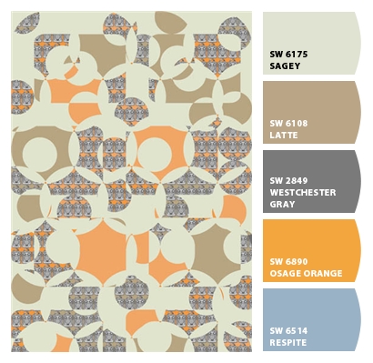
The 1970s fish scale pattern is brought up to date by using a more contemporary colour palette but still has a retro feel to it.

I think this design is successful and when it was printed on wallpaper it too on a certain faded quality which is great as long as the orange does not turn into peach. For some reason I have an aversion to peach!

Target market wise I would not consider this for John Lewis as it is not mainstream enough and perhaps even a bit too bold and quirky for their market. I would like to think that a high end homeware retailer such as Habitat would consider this print. Even independent home decor retailers might consider this if their product ranges were fairly quirky.


This is the same design only without the ladybird background dropped in. Again, the colours are much more subtle in the printed wallpaper.


I scaled the design smaller for this wallpaper and created a layered imagery using my photo of my Brownie camera. 

The Brownie image was my own photo with a pencil filter added in Photoshop I then added a little bit of acid green to the image before repeating it into the design. 

Although the Brownie camera is not from the 1970s its still vintage and works well my obsession relating to the rounded rectangle shape. I like the way that although the whole camera can not be seen it still is a familar shape and really a rather cute image (well to me anyway).

If I could develop the above designs it would be to add in tonal gradients or stripes in tones of orange to the fish scale motif and then repeat. I would be interested to see how this would change the design.