Showing posts with label 1970s. Show all posts

Friday, 1 February 2013

Pattern drawing by revolving stencils


This wonderful set of spirograph came to me from a relative who was having a clear out of games. I love the packaging colours and the way it is listed as being "A new invention for everyone"! The typography is simple and cool, I think.
This boxed game started me thinking how different children's games are today, there is something relaxing and meditative about creating spirographs. Inside the box the biros had long gone but there were delicate spirograph designs on papers- I have passed this on to my clever friend who makes recycled book kits www.homewardboundbooks.me.uk


Saturday, 19 May 2012

Final fabric design for upholstery

Here's my final fabric design slightly familiar but complete with little cameras in it. The colour palette has taken some work with these motifs and I eventually used more faded colours than I had previously used with a background cream inspired by old aged book pages.


Here is the design mocked up onto a stool (not the stool I will be using) just to give an idea of what it might look like ultimately. I have recently learnt to use the lasso tool properly in Photoshop and used it to create this image. This image is definitely one of the more successful ones for my Moodboard.


I would aspire to produce fabric that is good enough and sits well with Ercol's range of furniture. I like the idea of translating a series of prints into upholstery designs for furniture ranges. 

Final designs for wallpaper


This design was creating using my new fish scale motif and repeat filling the design in Photoshop I added colourways and also paint bucketted in my ladybird stack motif with the new faded colours and tidily cutout design.

The 1970s fish scale pattern is brought up to date by using a more contemporary colour palette but still has a retro feel to it.

I think this design is successful and when it was printed on wallpaper it too on a certain faded quality which is great as long as the orange does not turn into peach. For some reason I have an aversion to peach!

Target market wise I would not consider this for John Lewis as it is not mainstream enough and perhaps even a bit too bold and quirky for their market. I would like to think that a high end homeware retailer such as Habitat would consider this print. Even independent home decor retailers might consider this if their product ranges were fairly quirky.


This is the same design only without the ladybird background dropped in. Again, the colours are much more subtle in the printed wallpaper.


I scaled the design smaller for this wallpaper and created a layered imagery using my photo of my Brownie camera. 

The Brownie image was my own photo with a pencil filter added in Photoshop I then added a little bit of acid green to the image before repeating it into the design. 

Although the Brownie camera is not from the 1970s its still vintage and works well my obsession relating to the rounded rectangle shape. I like the way that although the whole camera can not be seen it still is a familar shape and really a rather cute image (well to me anyway).

If I could develop the above designs it would be to add in tonal gradients or stripes in tones of orange to the fish scale motif and then repeat. I would be interested to see how this would change the design.


Friday, 11 May 2012

Final shape for Wallpaper design


Who would have thought it could take so long to design this shape in Photoshop..

I knew that I wanted to use this shape within my patterns the moment I saw it in my photocopies of a Habitat catalogue from 1971. I discovered loads of backdated, vintage copies of Habitat and Clothkits catalogues from the 70s at the Research library within the National Museum of Scotland in Edinburgh. I had originally gone to take some photos of 70s memorabilia but ended up with lots of photocopies from this library. Here's the link and details of a fantastic library ..  National Museum of Scotland Research Library

It has not been easy creating this shape and I eventually discovered how to make it by playing with the shape tool options within Photoshop. It is basically 3 circle shapes in Photoshop but overlapped with a cutout on either side of the main circle. Looking good I think!

It is a great shape and so versatile, so I will be experimenting over the next few days to see what I can create with it. Really excited about the possibilities.

Monday, 7 May 2012

Anthropologie Wallpaper with Chip It!


Wow, I absolutely love this app.

This app allows you to add colour chips to images of your choice online. It's really easy to use and I have started to use it on a few more images.

A really useful feature for choosing colour palette options for my Final Major. Big thank you to Dyane Brown for pointing this superb app out to me.

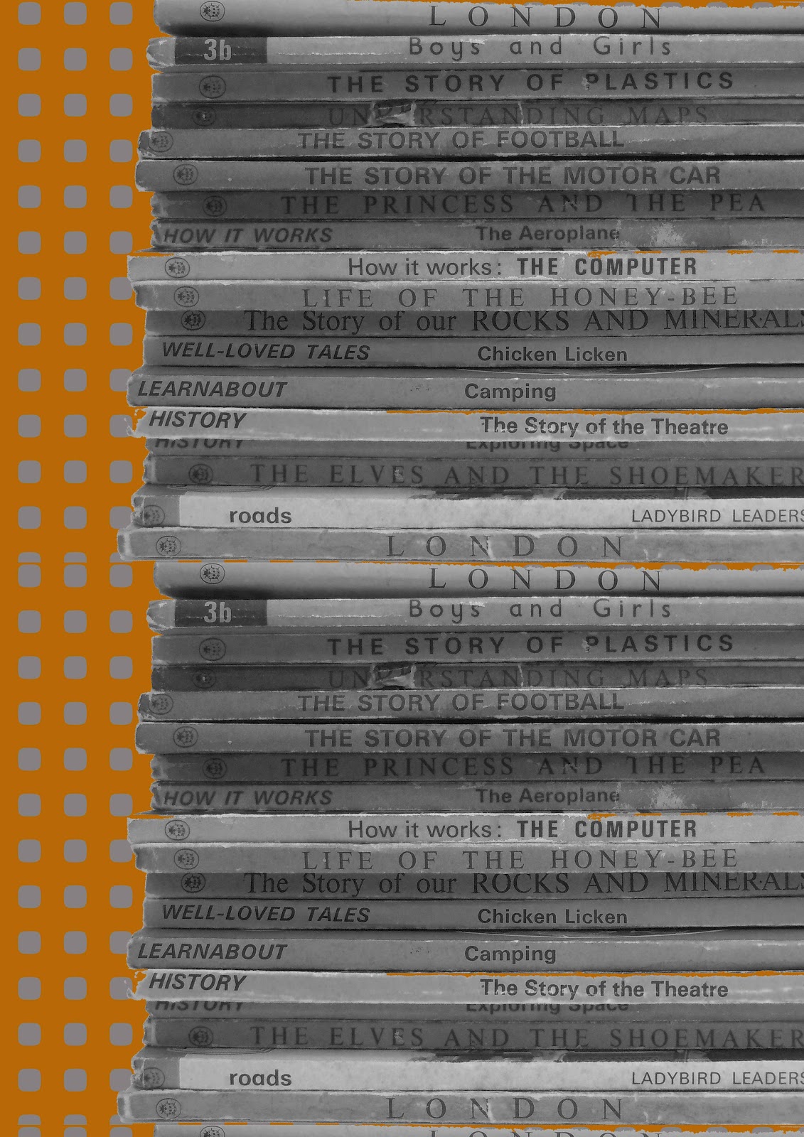
I had a thought whilst using this app that it would be a good idea to produce a design using my ever growing collection of vintage Ladybird Books. The colours of the spines and the front makes for a lovely retro colour palette that I could explore, although it may not be quite the colours I am looking for when marrying this up with my other geometric designs. It is possible that I could go monochrome or mute the colours of the books somewhat.

Friday, 4 May 2012

Interesting lampshades

I want to create a lampshade for my final which is a little bit different but still has a retro theme. I began thinking about macrame and crochet, 2 very 70s crafts which were popular back then and thought about adding a modern twist.

I came across Naomi Paul's lampshades earlier this year, they are fun, elegant and really distinctive.

Naomi Paul lampshades. Photography by Nick Rowchowski
34806855 b5JHCfty c
goldfingers.info

Very delicate and clever use of colour and placement.


6a00d83453d93d69e201116859f5e3970c-800wi
goldfingers.info

These lampshade are sweet, delicate and pod-like I like the mix of colours too.


Picnik collage1
paper collage lampshade. goldfingers.info

Paper collage - I love it! This is a style I could use with a mix of my shapes and geometric patterns.


A Thousand Picnics feature at trendland.com


Yes, I know it's not a lampshade but macrame plant holders from a shop called " A Thousand Picnics " in Williamsburg, Brooklyn. These clever and trendy people researched the 1970s home before opening their shop and found images of macrame plant holders. 


Source: theendcollective.blogspot.co.uk
More macrame - a plant holder and a very bold looking lampshade.


A good friend has also recently given me a book on macrame, so I wondered if I could translate this for my final lampshade into something exciting and different...Hmm.


Monday, 30 April 2012

Wallpaper draft design

After discovering Deborah Bowness' lovely wallpaper, I thought about taking my own photos and collaging these with some of my geometric patterns.

Here is one result of this initial experimentation using Photoshop to layer my own photo onto existing patterns.

This design uses my own photo (made black and white) of my favourite Ladybird books (all time favourite " The Elves and The Shoemaker" ). I had to use photoshop to repeat the stack of books height wise. I need to "cut out" the Ladybird stack better using Photoshop so that the background design does not bleed into the books - it needs to have a professional look, so I will be honing my Photoshop skills yet again!

I am thinking about this potential design for wallpaper and need to consider how large a design to do and what drop I want for the design. I will potentially be adding stitch, hand collage and a wee bit more colour to it.


More to follow soon ( I hope..)


Wednesday, 25 April 2012

Draft designs for Final Major so far....

I have been experimenting via Photoshop with various designs for my final and here are a few for you to critique, if you feel inclined.

My inspiration for all of these has been 1970s colour palettes, Scandinavian designs and  my camera obsession.


 The imagery behind of the camera repeats can not really be seen above and this design was the least popular in my crit, so I will not be taking this forward.


This is a very simple Scandi style print although it is perhaps too bright for a living room wall in its current form. I need to look into a more muted orange for this design and perhaps a different background shade.


Inspired by abstract illustrative art from the 1970s I feel this is successful in drawing the eye in different ways. It took a long time to create in Photoshop but I got there in the end. Again, the brightest orange needs muting in my opinion.


Friday, 20 April 2012

Siggi Eggertsson

Siggi Eggertsson is a really interesting Icelandic graphic designer/ illustrator. I have been exploring Scandinavian design with it's distinct graphicness, boldness and use of colour (IKEA here we come!) and it occurred to me that it has parallels with 1970s design in many ways. It is interesting the way most Scandi design has over the decades, never lost this strong sense of craft, colour and shape. This factor has made me explore the world of graphic design to a greater extent and I came across Siggi's fab work.

Siggi's work is playful and sometimes comments on world issues; such as his beautiful christmas baubles which feature an atomic bomb explosion (somewhat unexpected). He is equally at home though with designing geometrically pleasing patterns commercially for the likes of Mulberry for example. I was really happy to see the diversity of his work as it's very inspiring for my Final major project. His use of colour exploration is similar to mine and I when I look at his designs I visualize paper collage, a technique that I am keen to use in my FMP (Final Major Project).


Source:  www.siggieggertson.com

Monday, 27 February 2012

Life on Mars

I've been watching the first series of the brilliant "Life on Mars" again and enjoying all the retro reference material within. I am a big fan of this BBC series it is so well written and the visuals are fantastically absorbing, the attention to detail superb! For those of you who missed this series it's about a police officer from today, Sam Tyler who gets hit my a car and ends up in a coma but stuck in 1973... strange but true!
The colour palette is full of beiges and browns with splashes of greys and dark greens. Sam Tyler's flat has fab wallpaper with a collaged flower repeat pattern with some geometrics. The office is full of design inspiration objects such as an old dial telephone (not a trimphone), pendant lamps and grey filing cabinets. Sam Tyler and Gene Hunt (Tyler's boss in 1973) screech around dramatically in a boxy looking Ford Cortina. More on the series at this link.
http://www.bbc.co.uk/lifeonmars/explore/
Better start some drawing soon, I have lots of inspiration now.

Thursday, 23 February 2012

Final project ideas

Ideas for my final project are buzzing round my head with increasing frequency. Following on from my last project I have decided to stick with a 1970s vibe and hopefully create a print that is super adaptable to various interiors and homewares.
Hmmm.. How to achieve this though? My other niggling thought is that I need to develop a British theme that I am comfortable with that explores British quirkyness and eccentricities.
I need to look back at my childhood photos and talk with family to see what other themes pop into my head. What do you remember from the 1970s?